The Power of Visual Web Design: Making Your First Impression Count
Visual web design is the art of crafting a website’s aesthetic to create a compelling user experience. It uses elements like color, typography, and layout to communicate a brand’s message and make a powerful first impression—something users form in just 1/10 of a second.
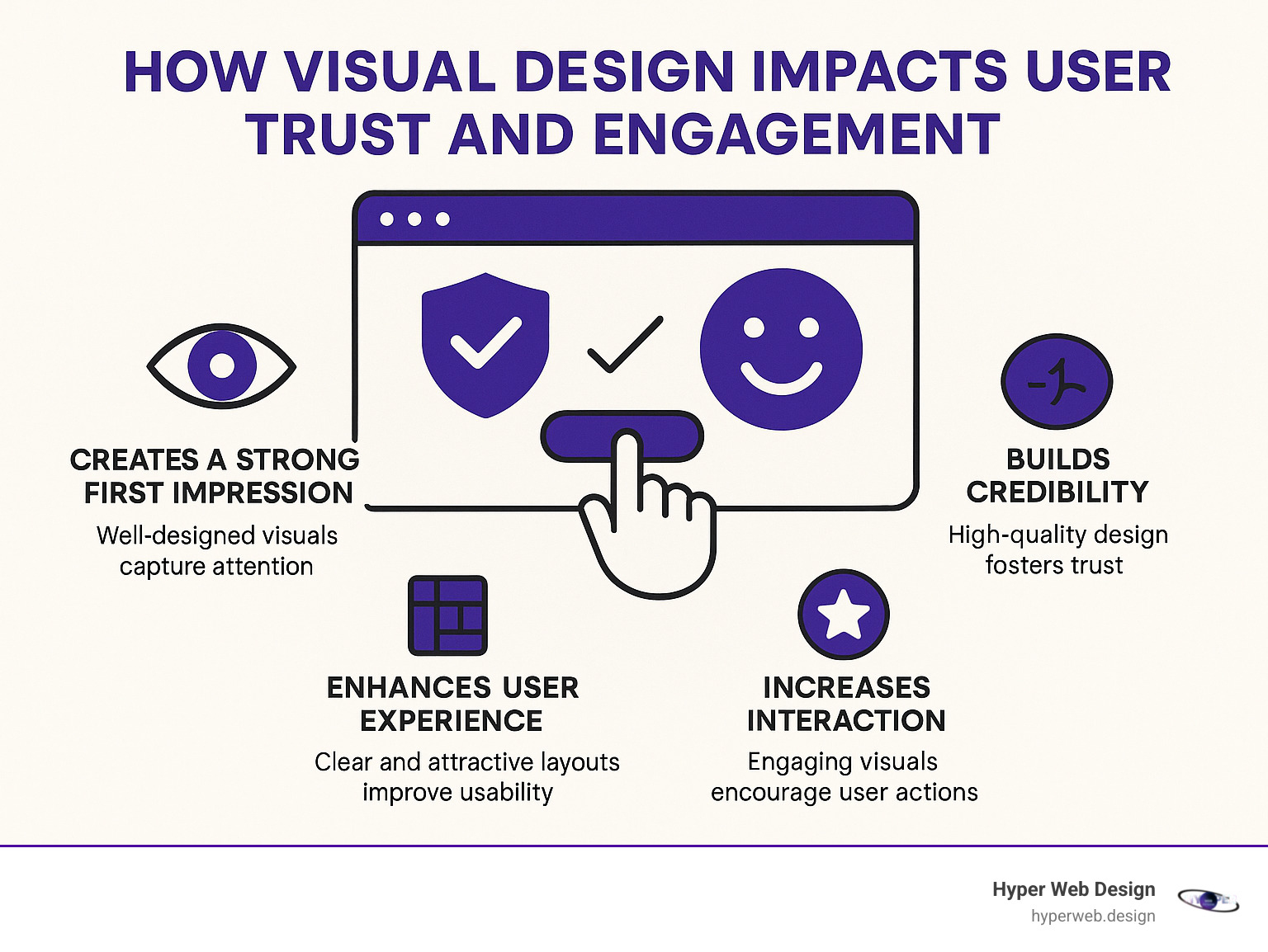
A strong visual design is crucial because it:
- Improves user experience (UX) by making sites easier to steer.
- Boosts engagement, keeping users on your site longer.
- Builds brand identity and trust through consistent, high-quality visuals.
- Increases conversion rates by guiding users toward desired actions.
People process images 60,000 times faster than text, so a memorable design creates a lasting positive feeling. Thoughtfully used visuals also improve accessibility and can even boost search engine rankings. A visually strong website isn’t just decoration; it’s a powerful business tool that impacts how users perceive your brand.
I’m Shawn Shameli, and for over a decade, I’ve helped businesses create websites that are not only visually engaging but also highly optimized, combining creative design with technical precision to deliver results in visual web design.
Key terms for visual web design:
The Core Components of Visual Web Design
Visual web design is about building a strong foundation with core elements and smart principles to create digital experiences that don’t just look good, but work beautifully and feel intuitive for every visitor.
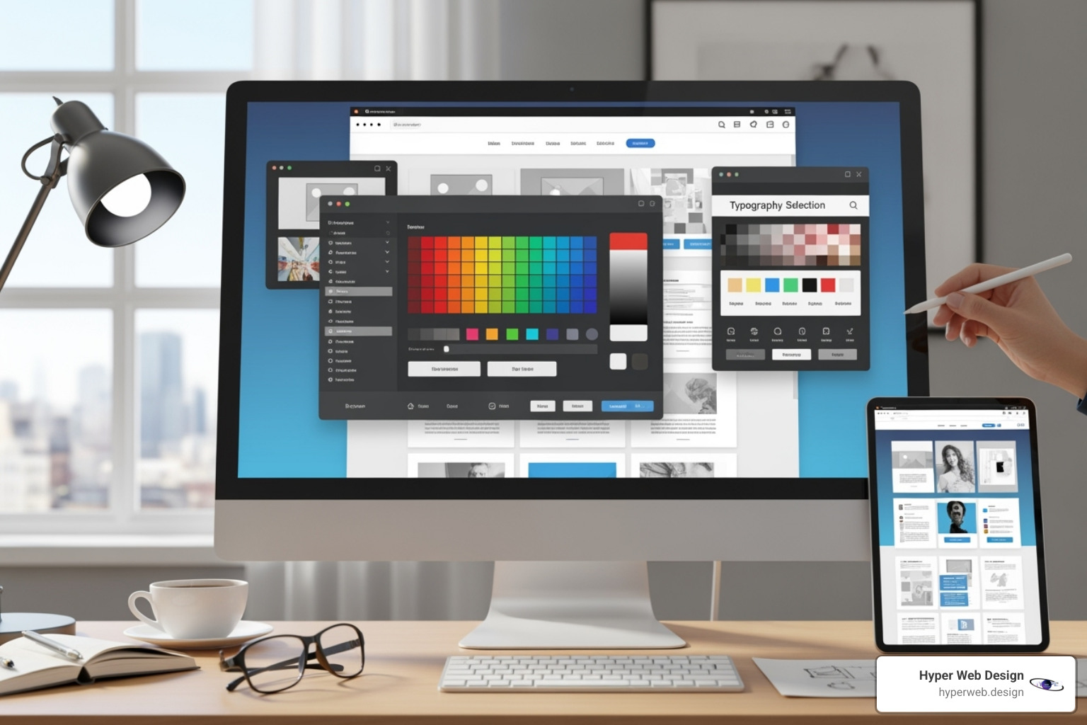
Essential Elements: Color, Typography, and Imagery
Think of a website as a masterpiece built piece by piece. The most vital pieces are the visual elements—the ingredients that form the backbone of any great visual web design.
First, Color is more than just a pretty shade; it impacts readability, accessibility, and brand messaging. We strategically select color palettes based on a site’s purpose and audience, using them to evoke emotion and ensure strong contrast for an optimal user experience.
Next, Typography is the art of making words easy to read and visually appealing. The choice between traditional Serif fonts and modern Sans Serif fonts greatly impacts a site’s feel. We prioritize web-safe fonts, a comfortable size (around 16 pixels), and proper spacing to ensure content is easy to digest. Pairing two different fonts can also create a stylish, professional look.
Finally, Imagery is incredibly powerful, as people understand pictures far faster than words. We use various types of visuals, each with a purpose:
- Your Logo is your brand’s heart, typically placed in the header for easy navigation.
- Photos connect with users on a human level. We use high-quality, fast-loading original or stock photos for everything from hero banners to blog posts.
- Illustrations are custom drawings that explain complex information and give your site a unique visual style.
- Mascots add a friendly, personal vibe to the user experience.
- 3D Renders create hyper-realistic images, perfect for showcasing complex products and adding a high-end feel.
The secret is ensuring all these elements work in harmony to create a cohesive visual language for your brand.
Key Principles for Effective Layouts and Hierarchy
Once we have the visual elements, we arrange them using smart layout principles. A well-laid-out website guides the user’s eye smoothly through the content.
Visual Hierarchy is our tool for directing attention (learn more about understanding visual hierarchy). Using size, color, spacing, and alignment, we signal what’s most important, making content easy to scan. Key techniques include:
- Size: Larger elements grab attention first.
- Contrast: High-contrast elements, like a bright button, stand out.
- Alignment: Neat alignment creates an organized, clean feel.
- Proximity: Grouping related items together visually connects them.
- Repetition: Consistent patterns build familiarity and make a site feel reliable.
Grids are the invisible blueprints for a balanced webpage, arranging content in columns and rows. We use responsive grids that adapt to any screen, from a large desktop to a small phone. We also apply design principles like the Rule of Thirds or the Golden Ratio to place key elements for perfect visual harmony.
Balance ensures a design doesn’t feel heavier on one side. Symmetrical balance feels formal and stable, while asymmetrical balance can be more dynamic and exciting.
Finally, Whitespace (or negative space) is the empty area around elements. It’s an unsung hero that gives content room to breathe, improves readability, and helps users focus on what matters, creating a calm and intentional layout.
Ensuring Accessibility and Responsiveness
A great visual web design must work for everyone on every device.
Accessibility (a11y) means designing for all people, including those with disabilities. We follow the Web Content Accessibility Guidelines (WCAG) to ensure our sites are inclusive. This includes:
- Color Contrast: Using tools like WebAIM’s contrast checker to ensure text is readable.
- Alt Text: Adding image descriptions for screen readers.
- Keyboard Navigation: Making the site fully usable without a mouse.
- Content Comprehension: Using clear language and providing media alternatives like captions.
Responsive Design is a must-have, as over half of all web traffic is now mobile. It ensures your website automatically adjusts to fit any screen size perfectly. We often use a mobile-first approach, designing for the smallest screens first. This prioritizes core content and guarantees a great experience for the majority of users.
Innovations and Trends in Visual Web Design
The world of visual web design is constantly evolving with new tech and creative ideas. To stay ahead, we accept innovations that make digital experiences more engaging and future-proof. Here are some exciting trends:
- AI-Generated Imagery: Using AI to create unique and stylish visuals quickly.
- 3D Elements: Adding depth and a futuristic feel with detailed 3D models and animations.
- Motion UI: Using subtle animations and fluid effects to make interfaces feel more alive and responsive.
- Dark Mode: A popular option that reduces eye strain and makes visuals pop.
- Minimalism: Focusing on clarity and performance by removing unnecessary elements.
- Nostalgic Aesthetics: Reviving retro styles from the Y2K era with a modern twist.
- Glassmorphism: A style using transparency and blur to create a “frosted glass” effect, adding depth to UI elements.
These trends are tools we use thoughtfully to improve a project’s goals, not just to follow a fad.
Bringing Your Vision to Life
Creating compelling visual web design requires a blend of creative vision and technical precision. Understanding the journey from idea to launch is key to achieving your business goals.
The Visual Design Workflow: From Ideation to Launch
Our visual web design process is structured and goal-oriented. We start with ideation and research, defining your audience and goals. We analyze competitors to find opportunities for your brand to stand out. This leads to mood boards and style tiles that capture your brand’s personality.
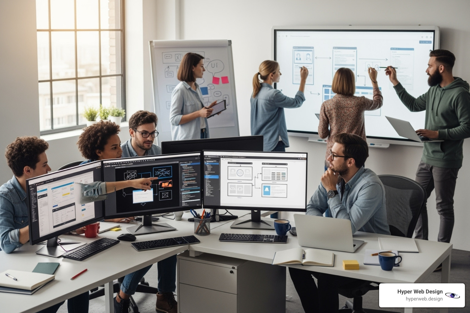
We then build wireframes and prototypes to map out the site’s structure and user flow, allowing for testing before development. During the site design and layout phase, we apply visual hierarchy to guide users naturally. The process doesn’t end at launch; we continuously test and iterate to improve performance and drive conversions, ensuring your site loads in under three seconds to maximize engagement.
Collaboration, Tools, and Driving Conversions
Exceptional visual web design is a team sport. Visual designers, UX/UI specialists, and developers must collaborate seamlessly. This synergy, powered by tools like Figma, Adobe Creative Suite, and Webflow, ensures the final product is both stunning and technically sound.
All our efforts serve one purpose: achieving your business goals. A professional design builds brand identity and trust, while an intuitive experience boosts engagement and retention. We focus on conversion optimization, using strategic call-to-action placement and clear user journeys to turn visitors into customers.
At Hyper Web Design, we pride ourselves on crafting secure, conversion-focused, and visually stunning digital experiences. Our approach blends luxury design with advanced technology, ensuring your website isn’t just a digital presence—it’s a powerful business tool that drives real growth.
Ready to transform your vision into reality? Contact us for a consultation and let’s create something extraordinary together.

